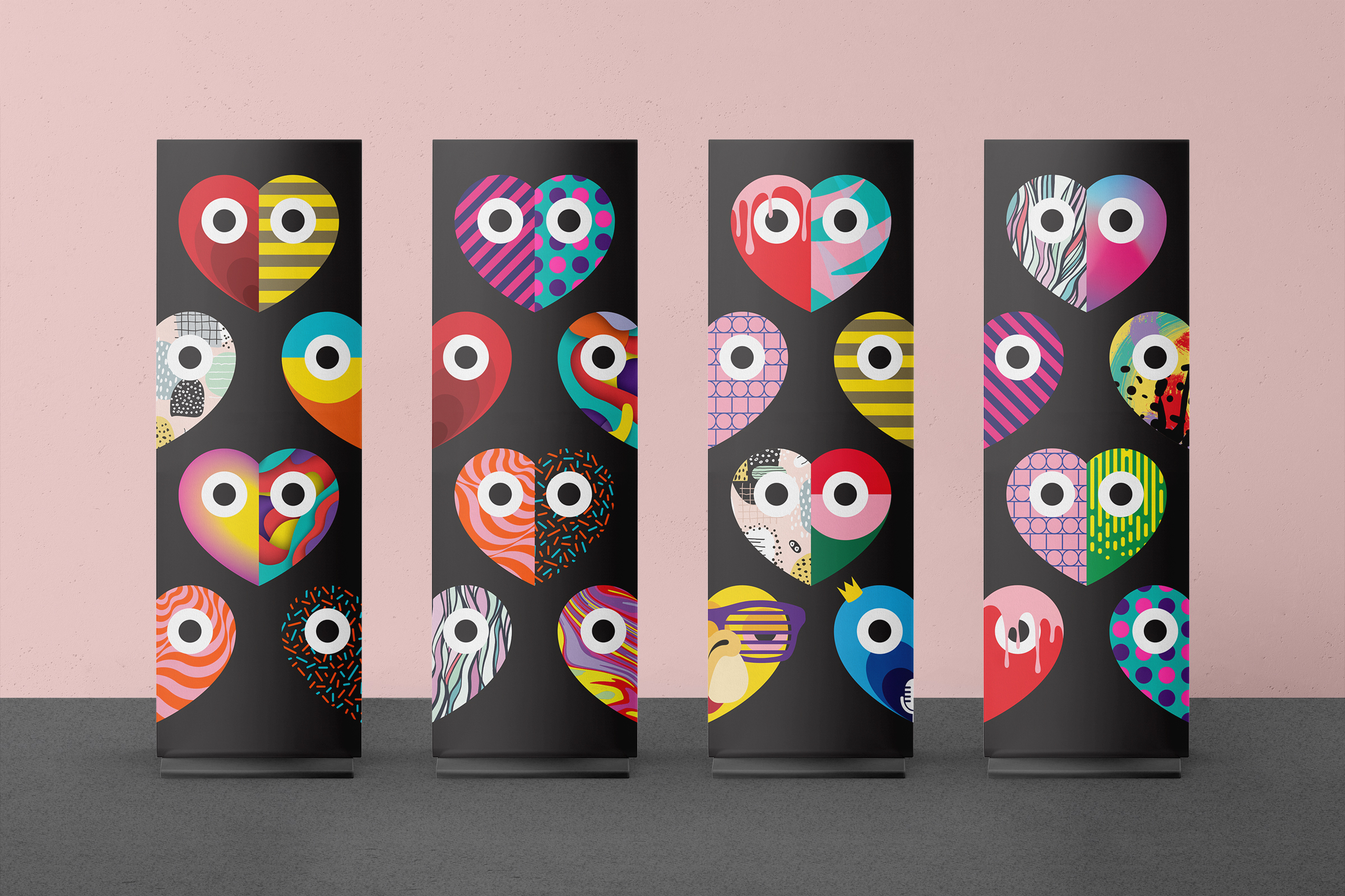
G Stock 24
Art Direction & Design: Kiros Chu
Copywriting: Janina Enrile
Visual identity for G Stock, the annual conference for G Adventures where staff memebers from multiple global offices would gathered at Base Camp, Toronto’s headquarter, for a five-day event made up of presentations, interactive sessions, dinners and parties to create meaningful connections.
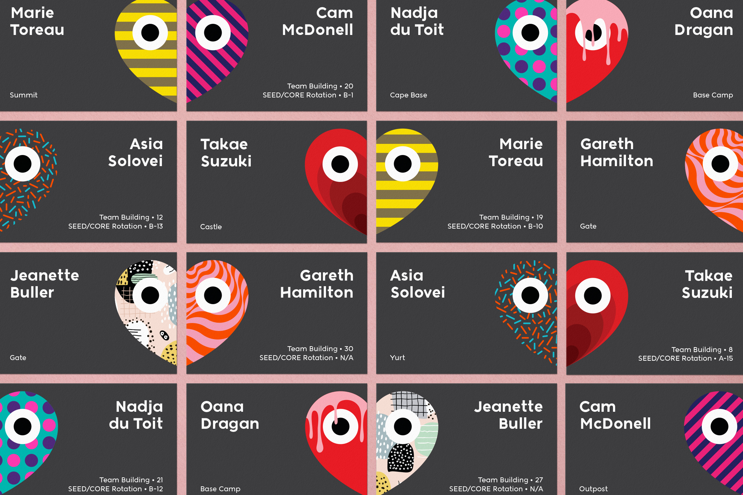
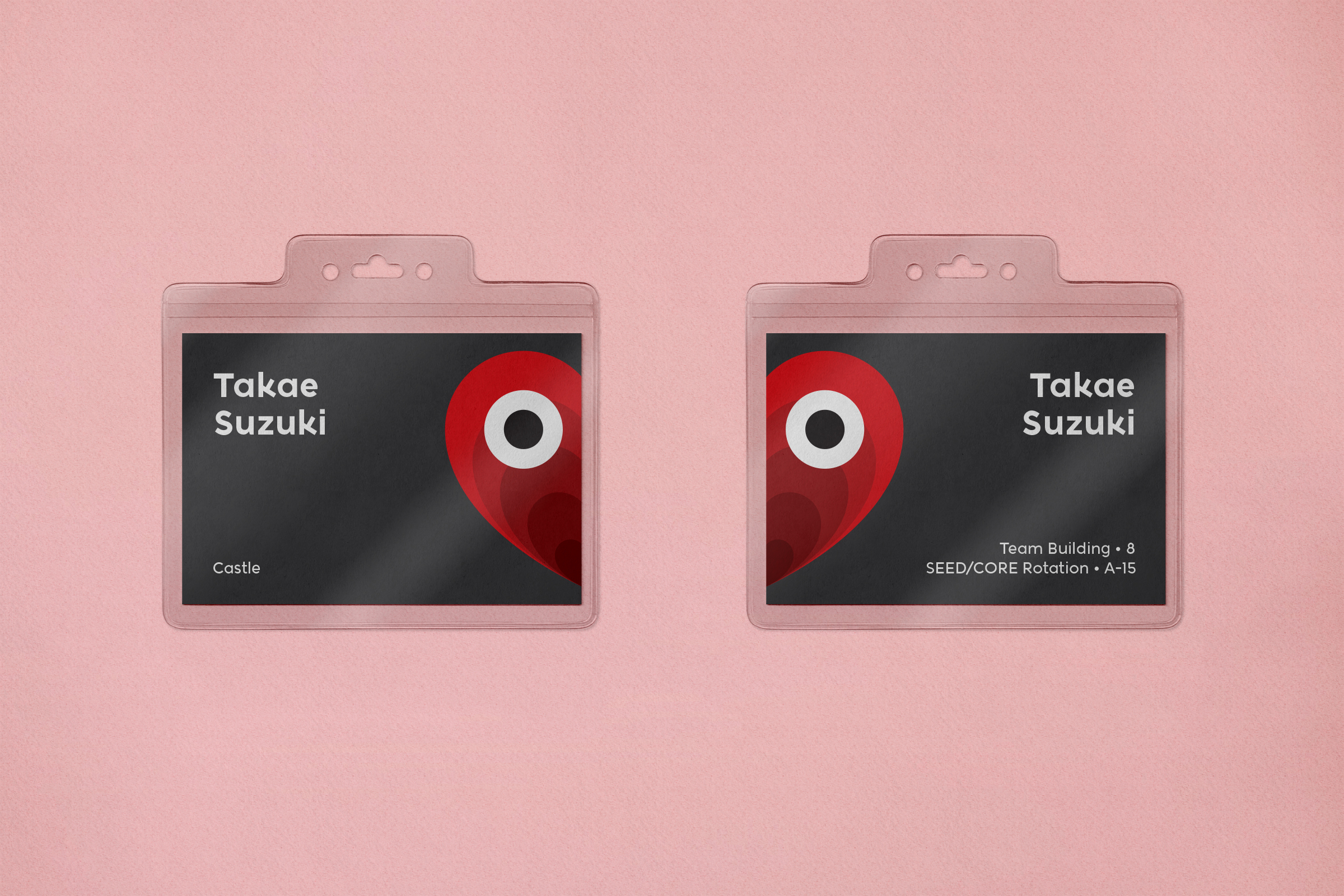
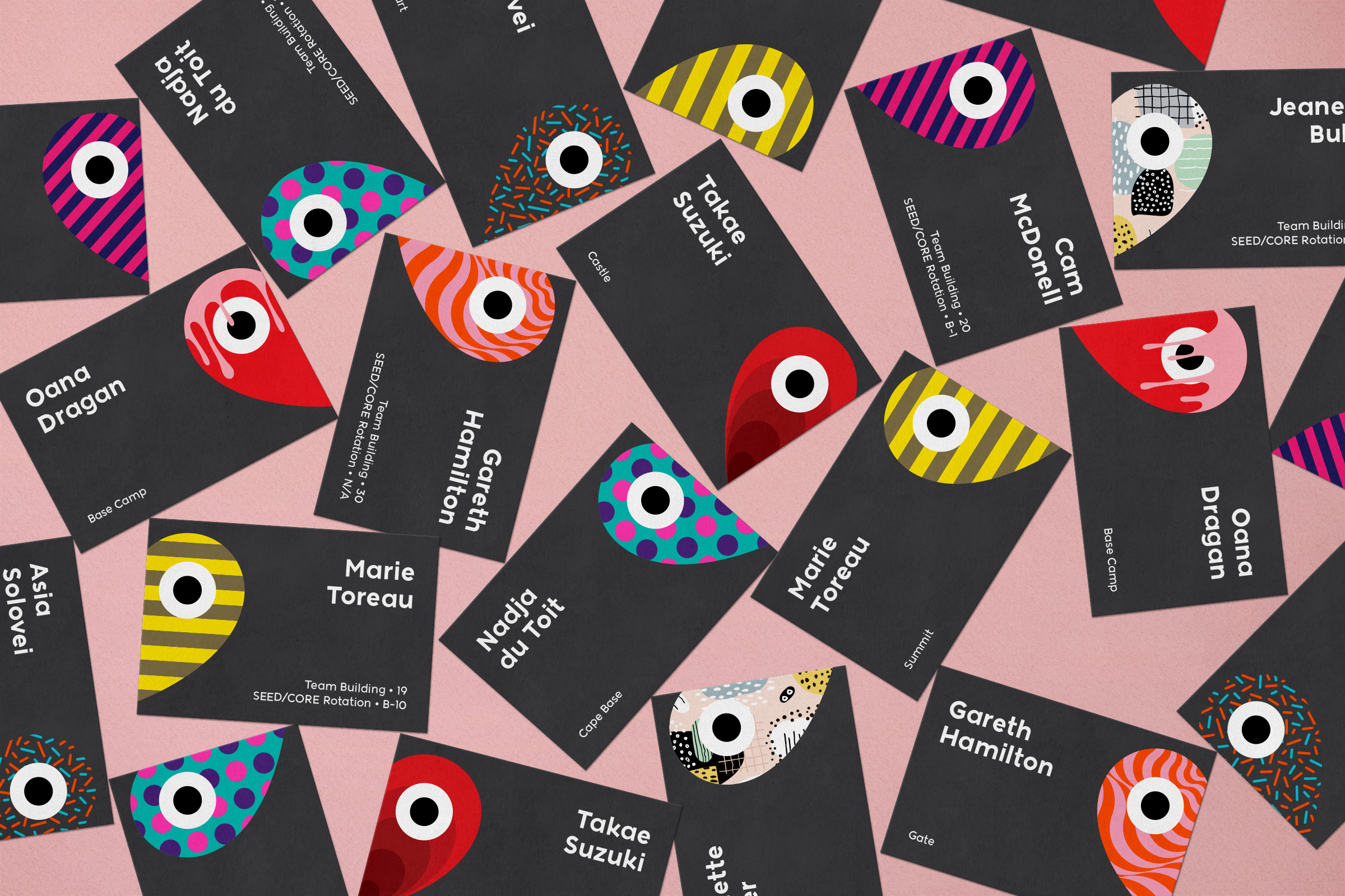
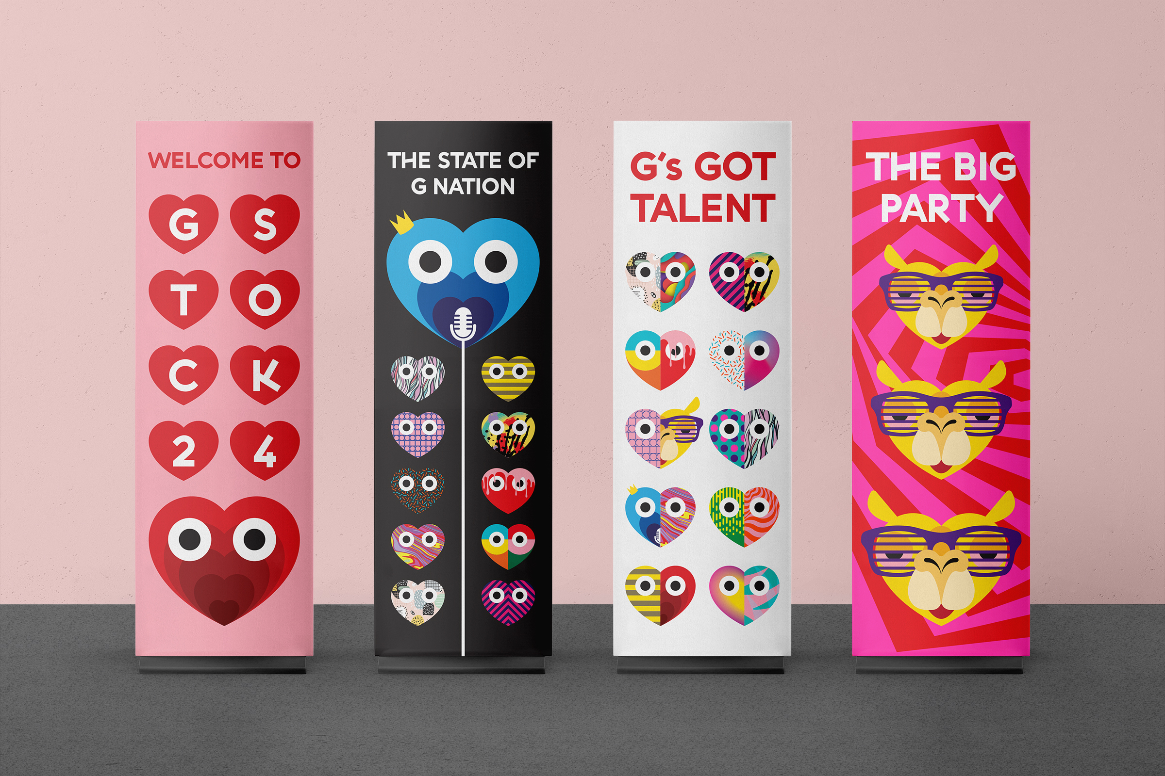
The theme for G Stock 24 was “love”. The iconic heart shape was used with a variety of patterns to create a pool of graphic elements that can be paired into countless combinations representing the idea of boundless love.
The theme for G Stock 24 was “love”. The iconic heart shape was used with a variety of patterns to create a pool of graphic elements that can be paired into countless combinations representing the idea of boundless love.

